Café Caracol
Visual identity for Café Caracol (caracol being Portuguese for snail), a specialty coffee brand from Serra do Caracol, Sul de Minas, Brazil. The farm sits at 1,100 meters of altitude, on volcanic soil, one of the most expressive coffee-growing territories in the country. The identity was built from the inside out: the name carried everything the brand needed.
Identidade visual para o Café Caracol, marca de café especial originária da Serra do Caracol, Sul de Minas. A fazenda está a 1.100 metros de altitude, em solo vulcânico, um dos territórios de maior expressão na produção cafeeira do país. A identidade foi construída de dentro para fora: o nome carregava tudo o que a marca precisava.
Visual Identity
The specialty coffee market has consolidated a visual language of its own: muted tones, refined typography, an aesthetic of restraint that signals quality through sobriety. Café Caracol takes the opposite position, with personality and deliberate irreverence, without ever losing sight of the exceptional product it represents. The visual identity was built on this tension: exceptional coffee, playful brand.
O mercado de cafés especiais consolidou uma linguagem visual própria: tons contidos, tipografia refinada, uma estética que sinaliza qualidade através da sobriedade. O Café Caracol toma a posição oposta, com personalidade e irreverência deliberada, sem perder de vista o produto excepcional que representa. A Identidade Visual foi construída sobre essa tensão: café excepcional, marca divertida.
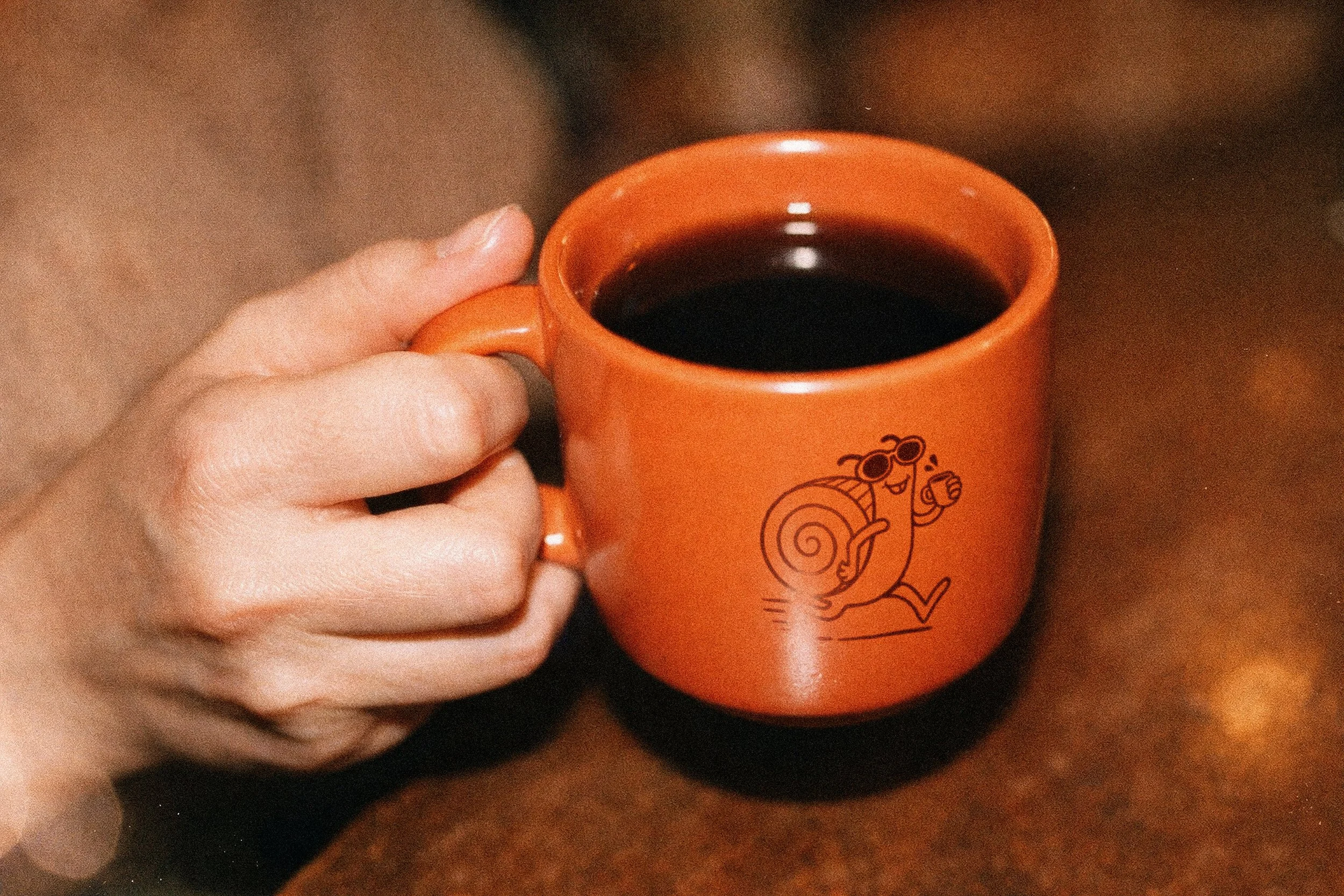
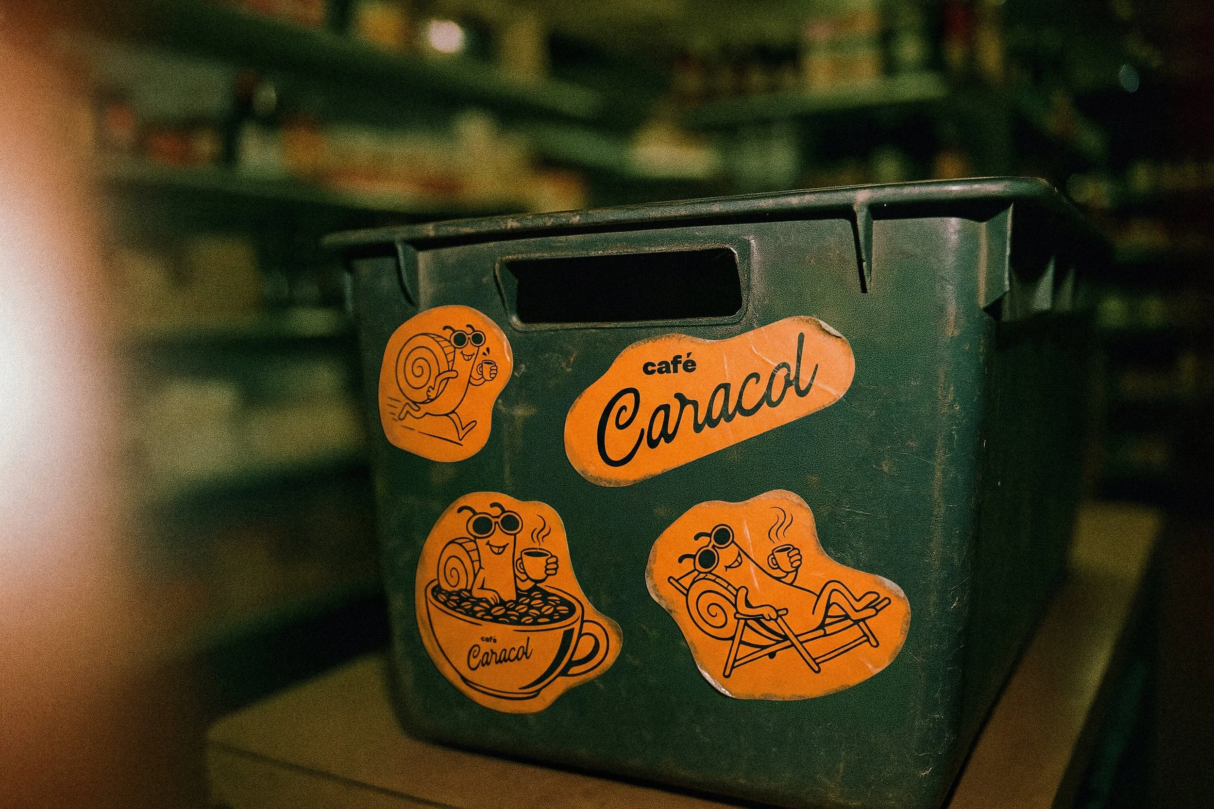
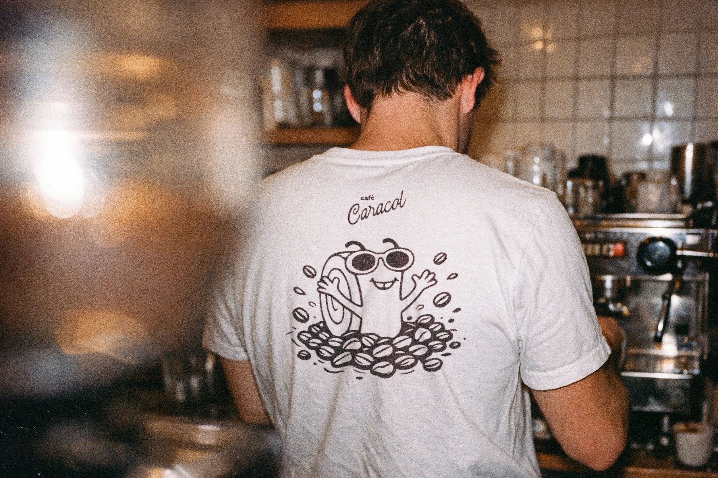
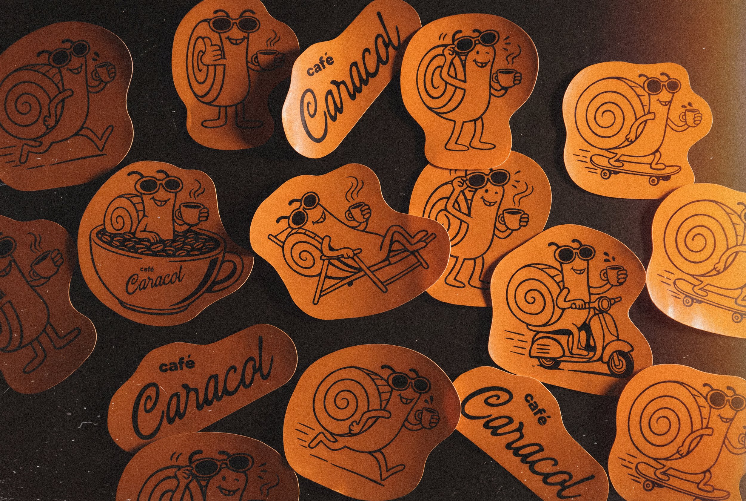
Mascot
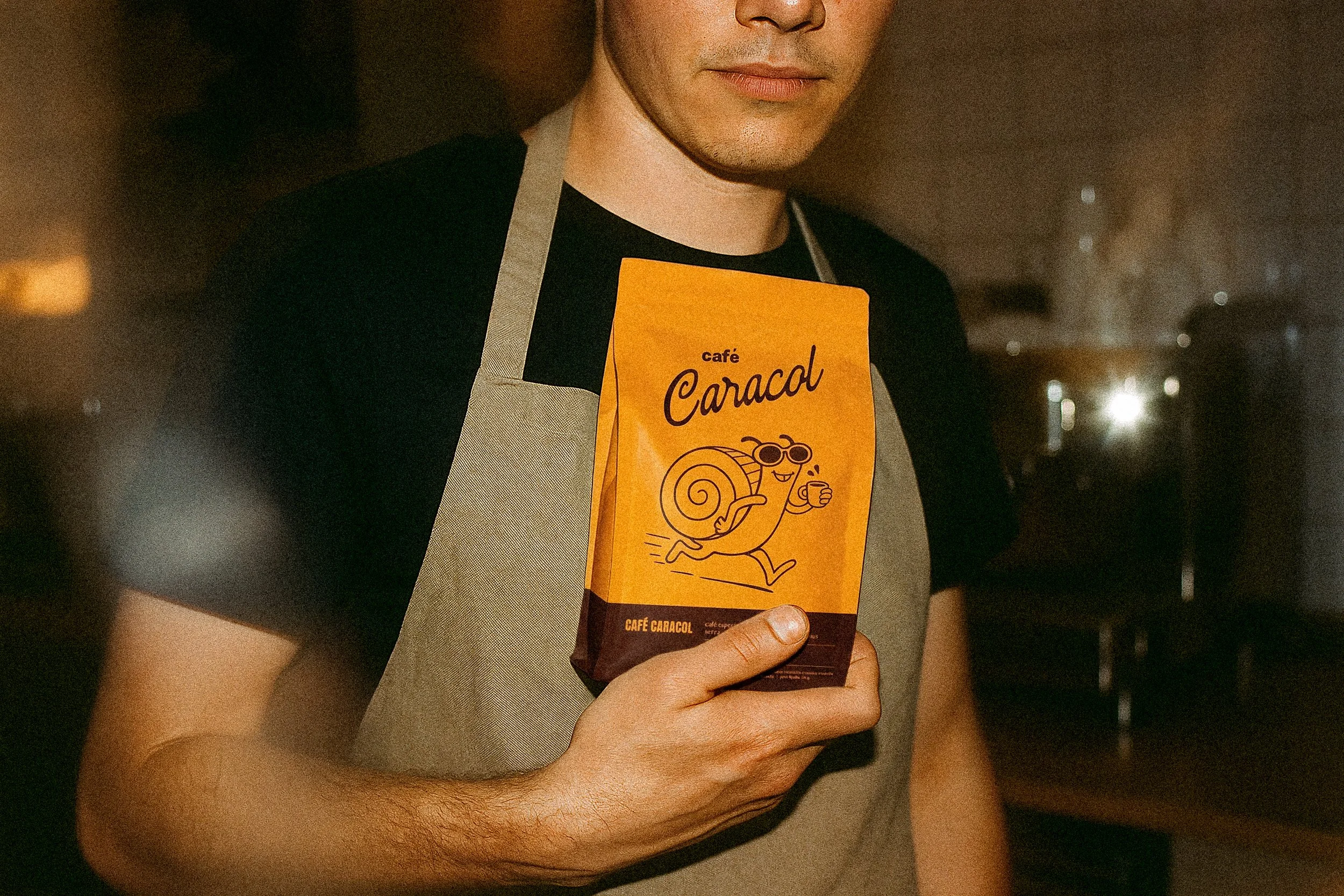
The snail is, by nature, an unhurried creature. The Café Caracol mascot subverts this expectation entirely: he wears sunglasses, holds a coffee cup in hand, and is always in motion. The character was illustrated across multiple situations, each reinforcing the same idea: the energy of an exceptional coffee, expressed through the personality of an unlikely snail.
The character functions as the brand's emotional core. Its warmth and humor establish a tone that is rare in the specialty coffee market: approachable without being trivial, playful without undermining the craft behind the cup. And the running snail turned out to be more than a visual choice. Café Caracol, produced in Sul de Minas, will operate a distribution center in São Paulo, offering same-day delivery across the city, a rare feat among artisanal producers. The mascot had to be the fastest snail in the coffee world.
O caracol é, por natureza, uma criatura sem pressa. O mascote do Café Caracol subverte completamente essa expectativa: ele usa óculos escuros, segura um café na mão e está sempre em movimento. O personagem foi ilustrado em diferentes situações, cada uma reforçando a mesma ideia: a energia de um café excepcional, expressa através da personalidade de um caracol improvável.
O personagem funciona como o núcleo emocional da marca. Seu calor e humor estabelecem um tom raro no mercado de cafés especiais: acessível sem ser banal, irreverente sem abrir mão da qualidade do que está na xícara. E o caracol em disparada é mais do que uma escolha visual. O Café Caracol, produzido no Sul de Minas, vai operar um centro de distribuição em São Paulo, com entrega no mesmo dia para toda a capital. Um diferencial raro entre produtores artesanais. O mascote tinha que ser o caracol mais veloz do mundo do café.
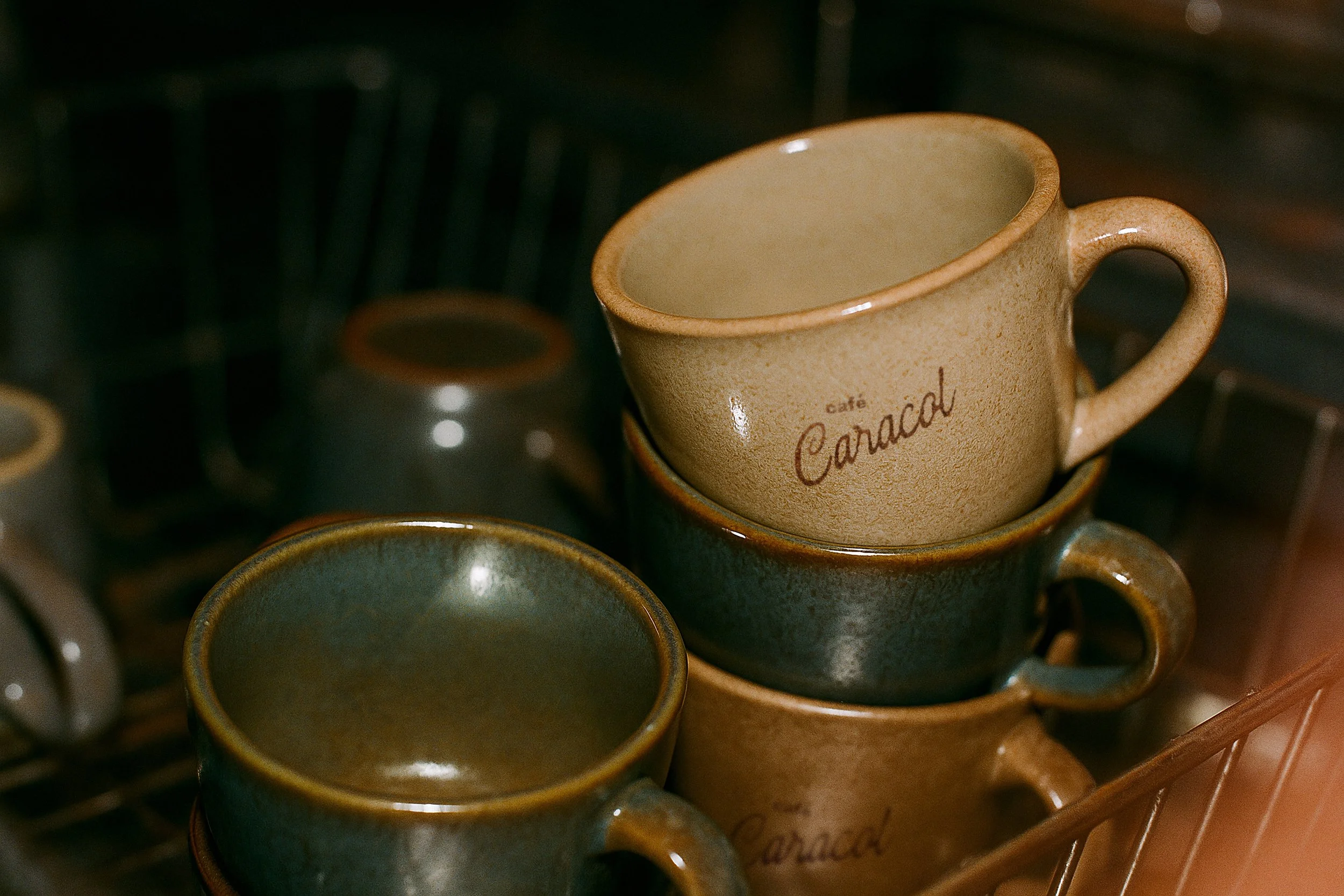
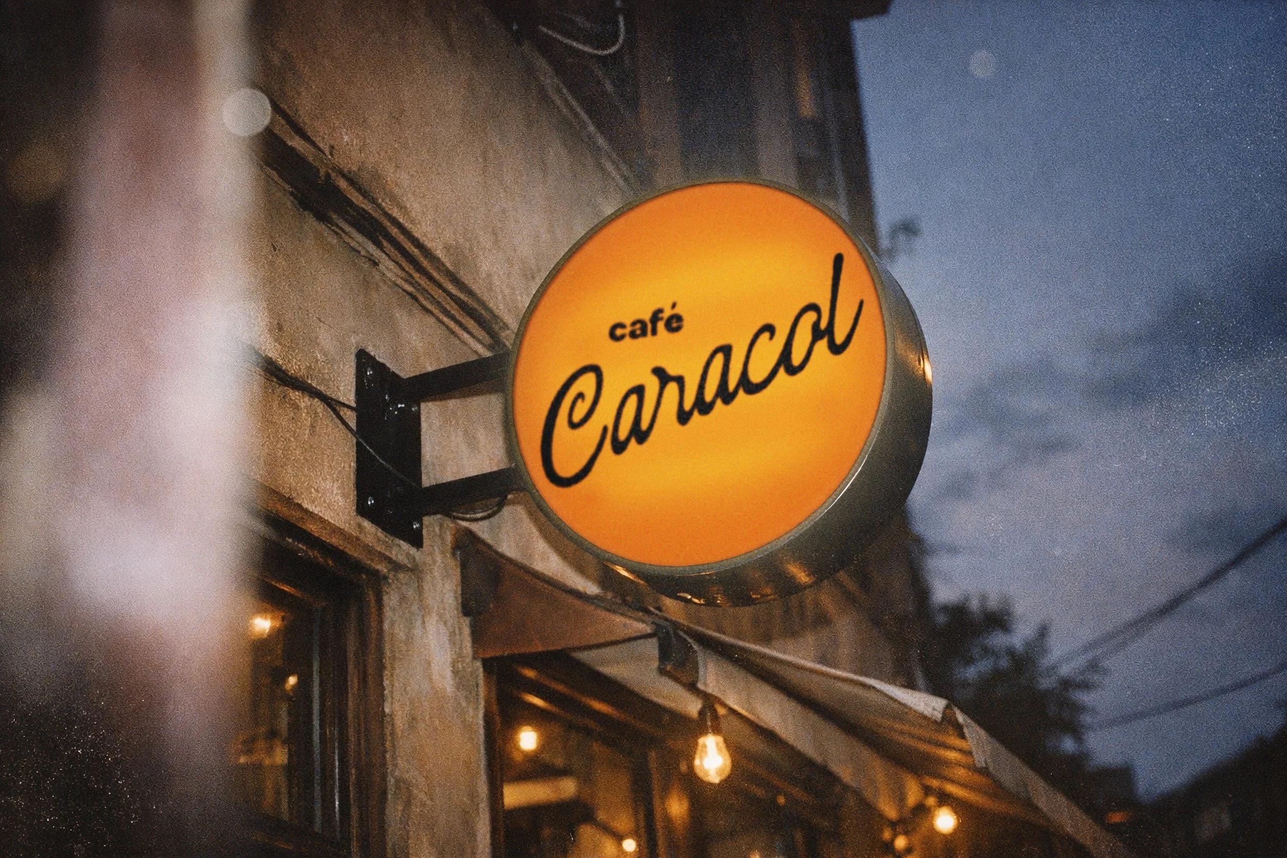
Logotype
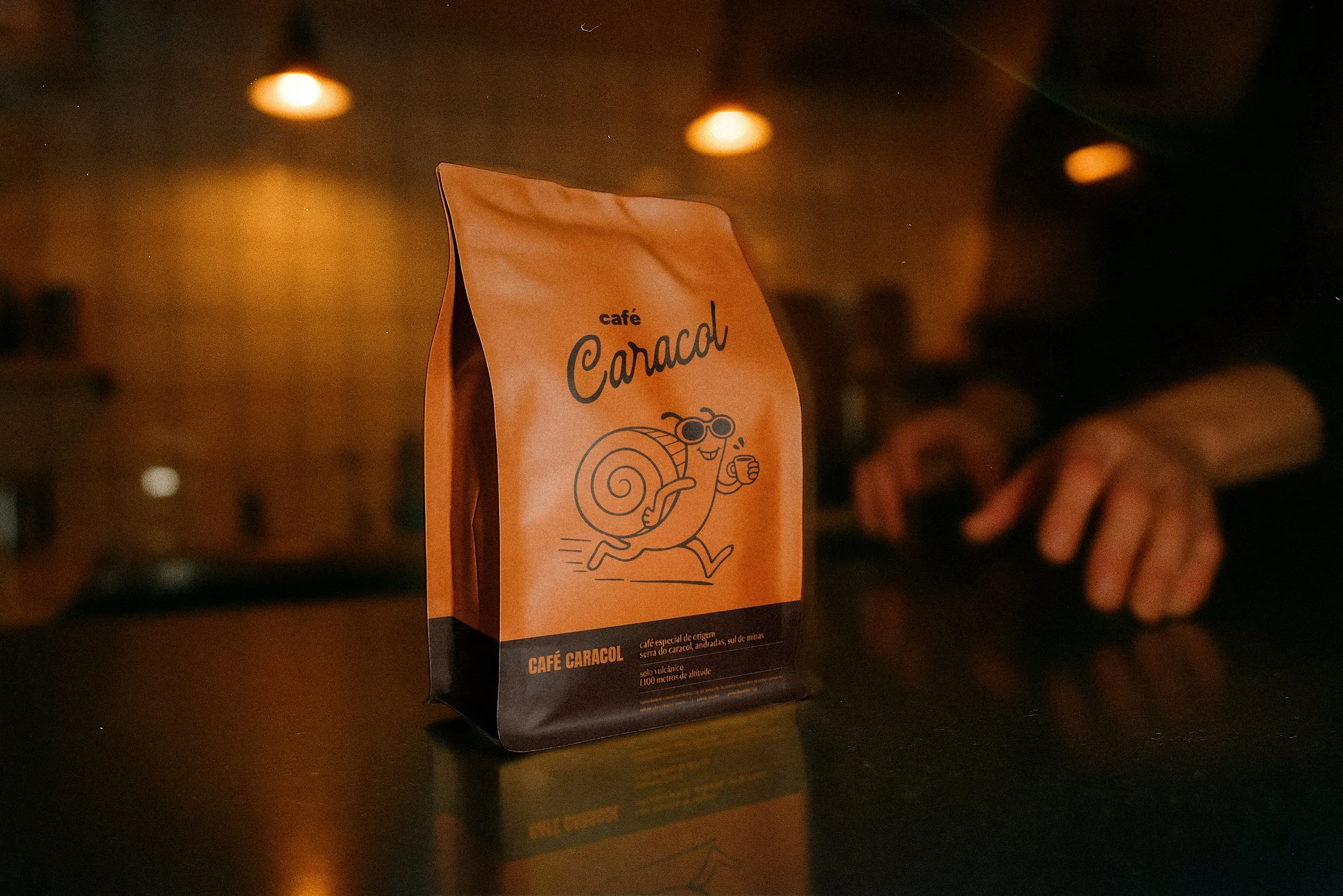
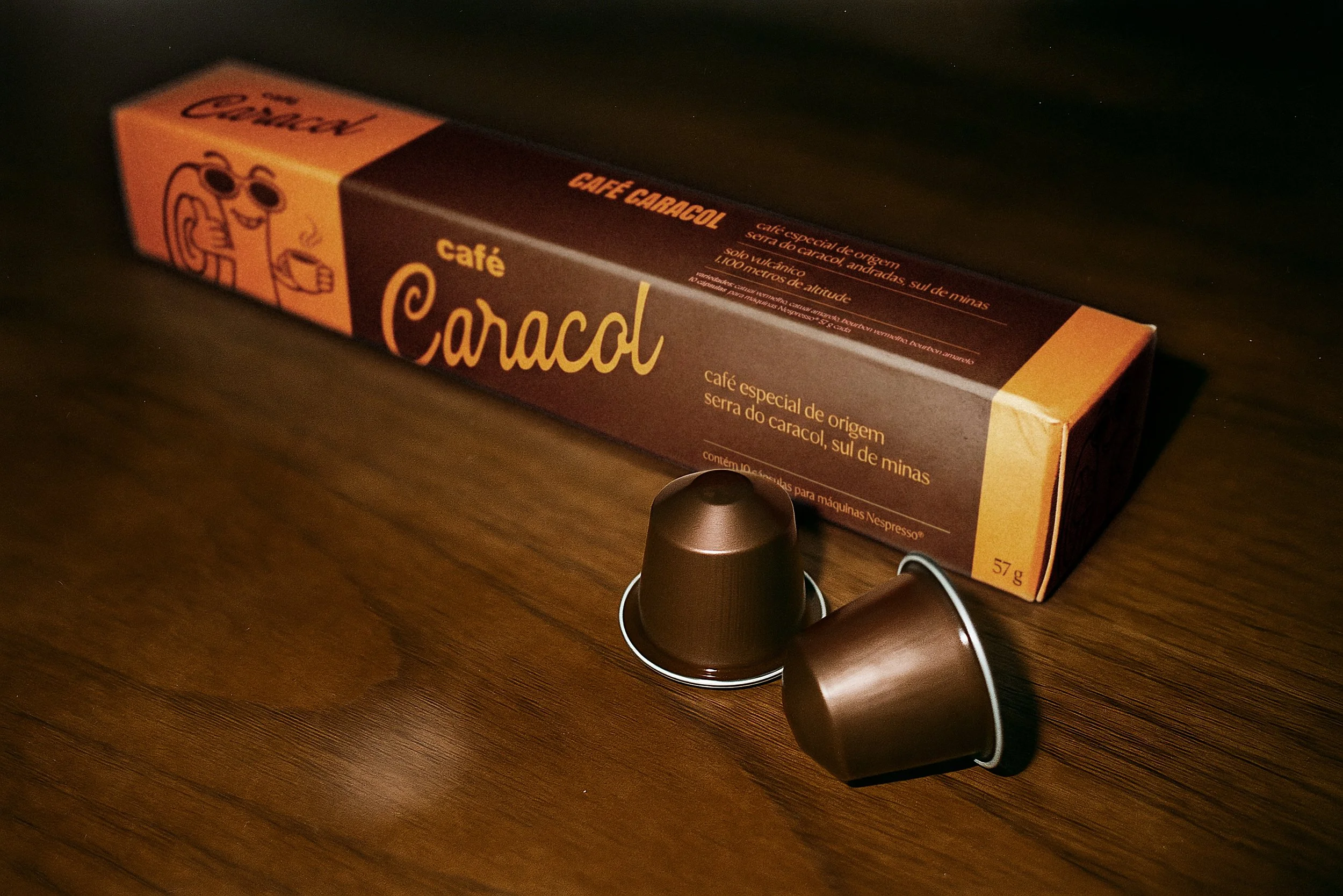
The logotype combines two typographic registers. "café" is set in bold, sans-serif, with rounded corners, functioning as a qualifier. "Caracol" is rendered in a flowing script, whose curves refer to the spiral of the snail's shell, the same form that names the place, the product, and the mascot.
The script carries a handcrafted quality that connects the brand to its artisanal origins. At the same time, the construction is controlled enough to hold its presence across all formats, from the retail packaging to an illuminated outdoor sign.
O logotipo combina dois registros tipográficos. "café" é composto em fonte bold, sem serifa, com cantos arredondados, funcionando como qualificador. "Caracol" é executado em uma script fluida, cujas curvas remetem deliberadamente à espiral da concha do caracol, a mesma forma que nomeia o lugar, o produto e o mascote.
O script carrega uma qualidade artesanal que conecta a marca às suas origens. Ao mesmo tempo, a construção é suficientemente precisa para manter sua presença em todos os formatos, da embalagem de varejo ao luminoso de fachada.
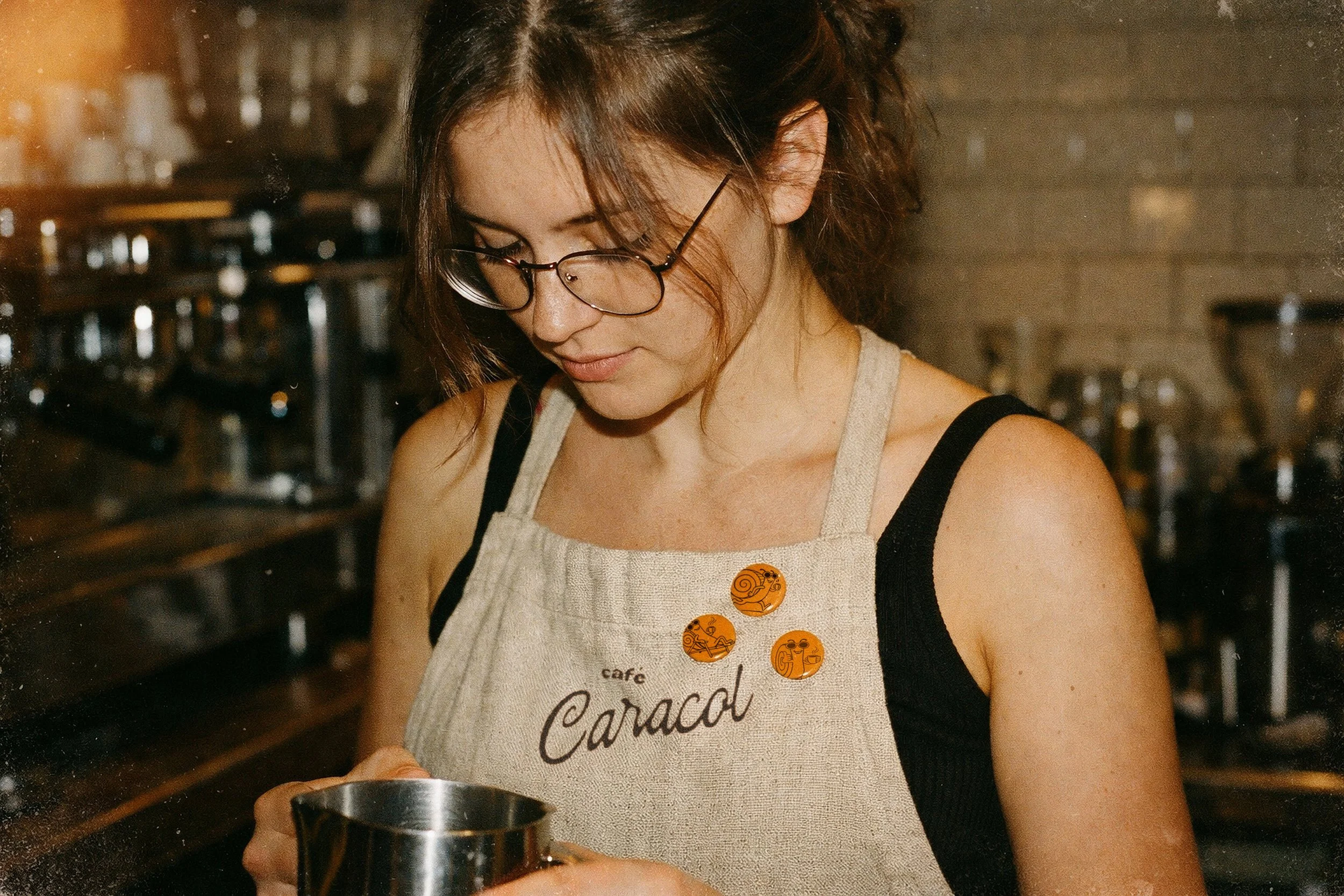
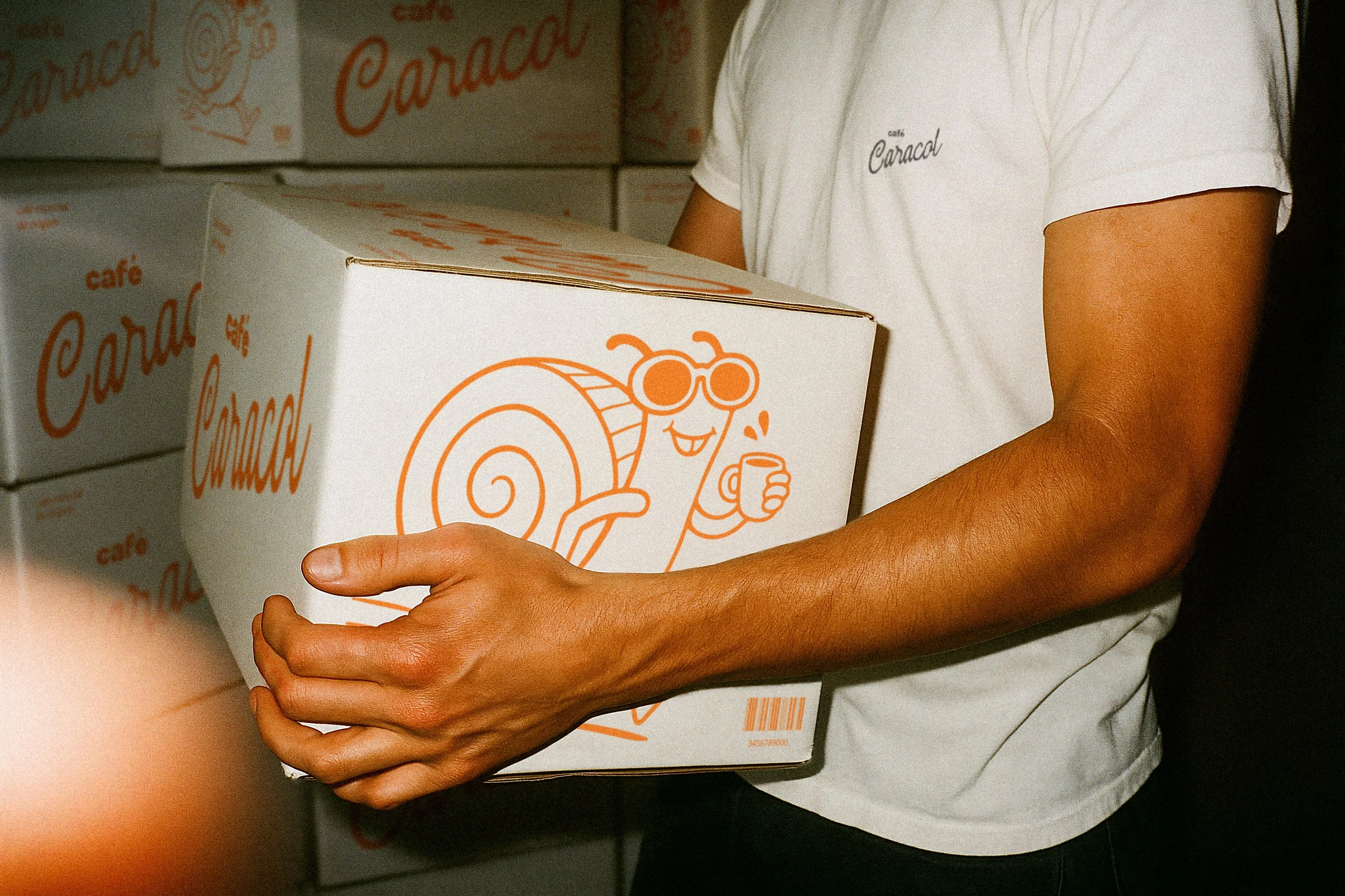
Packaging
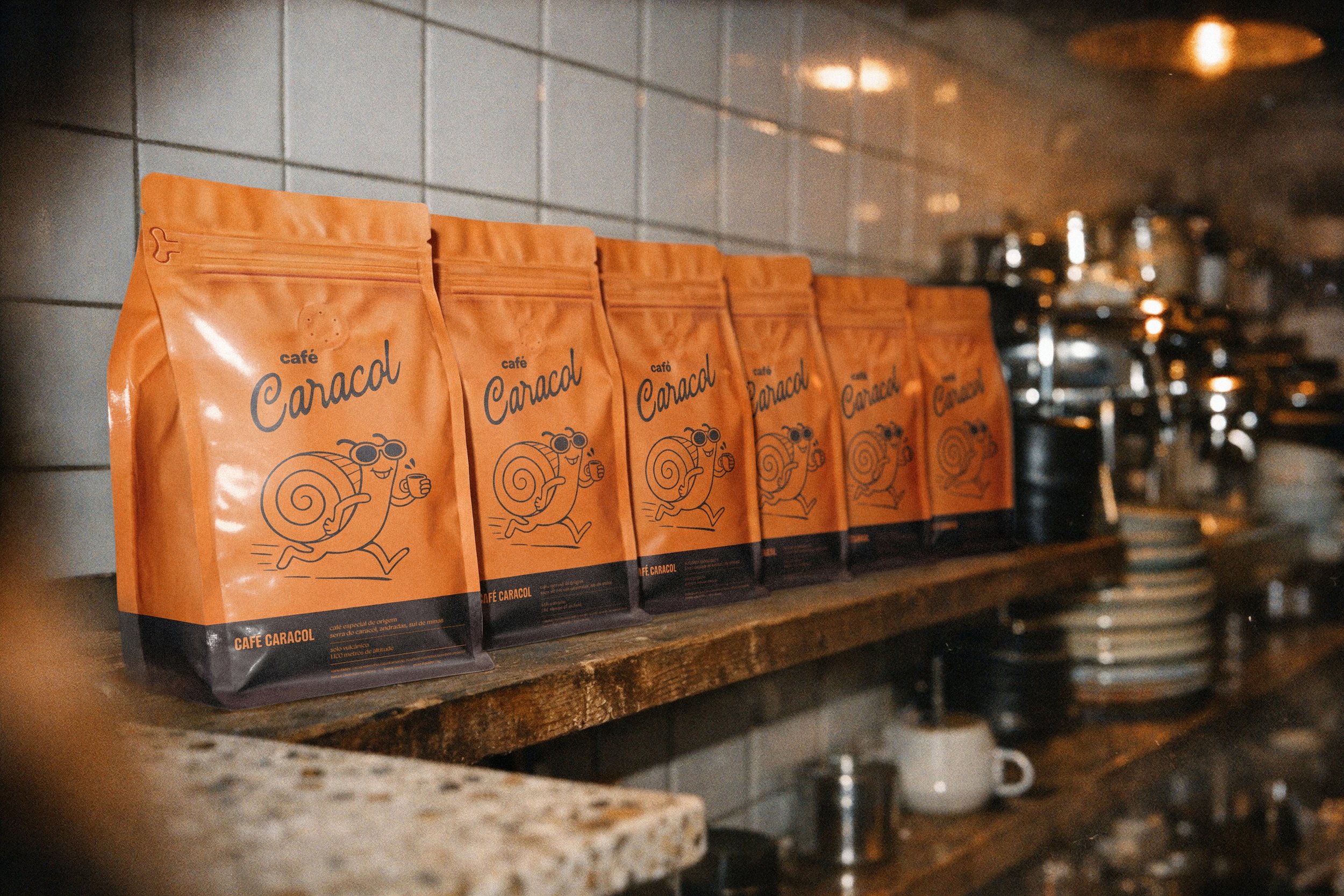
The packaging system articulates the visual identity across multiple formats. The front panel of the retail pouch is dominated by the mascot illustration in full expression, set against the brand's orange. A dark brown band at the base anchors the product information, establishing a clear visual hierarchy between character and content.
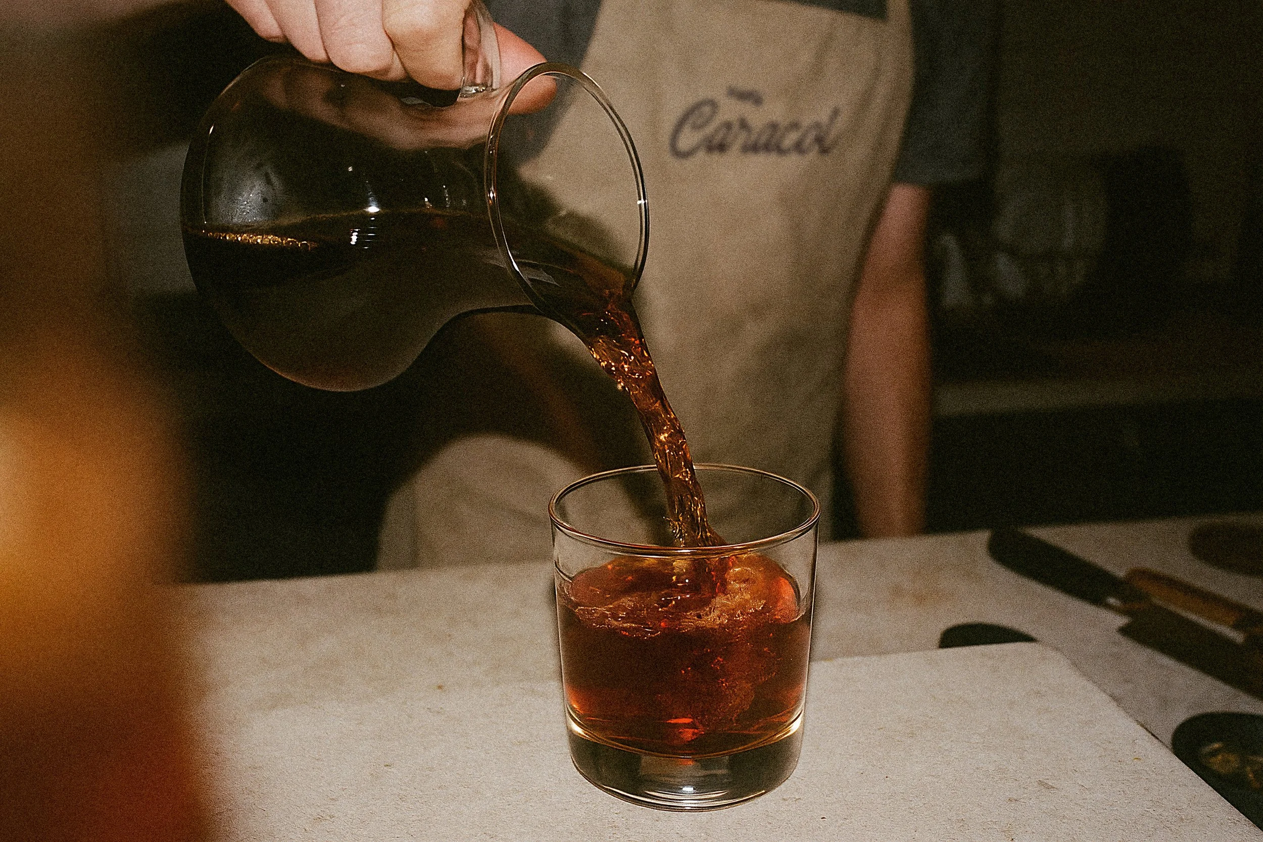
The system extends naturally to Nespresso-compatible capsule boxes, shipping cartons, ceramic mugs, glassware, aprons, pins, stickers, and apparel. Across every application, the brand retains the same warmth and conviction: the snail is always present, always caffeinated, always at home.
O sistema de embalagem articula a identidade visual em múltiplos formatos. O painel frontal do pouch de varejo é dominado pela ilustração do mascote em plena expressão, sobre o laranja da marca. Uma faixa marrom escura na base ancora as informações do produto, estabelecendo uma hierarquia visual clara entre personagem e conteúdo.
O sistema se desdobra naturalmente em caixas de cápsulas compatíveis com Nespresso, caixas de envio, canecas de cerâmica, copos de vidro, aventais, bottons, adesivos e vestuário. Em cada aplicação, a marca mantém o mesmo calor e convicção: o caracol está sempre presente, sempre ligado, sempre em casa.
Colors
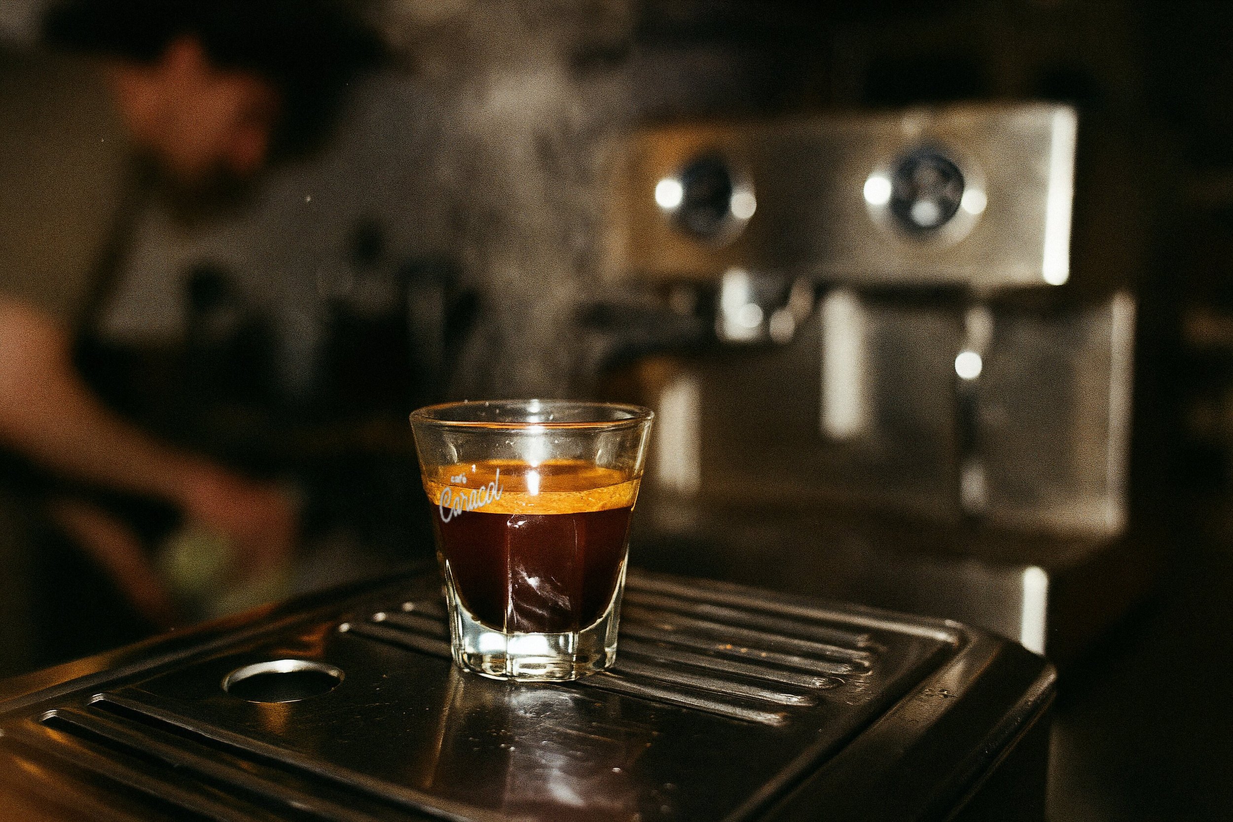
Amber orange and coffee brown form the brand's chromatic foundation. Orange references the warmth of the roast, the clay of Sul de Minas soil, and the restless energy of the mascot. Brown anchors the system in the natural world of coffee: the bean, the extraction, the cup.
The two colors create a palette that is at once appetizing and immediately distinctive on shelf.
Laranja âmbar e marrom café formam a base cromática da marca. O laranja referencia o calor da torra, o barro do solo do Sul de Minas e a energia inquieta do mascote. O marrom ancora o sistema no mundo natural do café: o grão, a extração, a xícara.
As duas cores criam uma paleta ao mesmo tempo convidativa e imediatamente distinta na gôndola.