Grupo Trevo
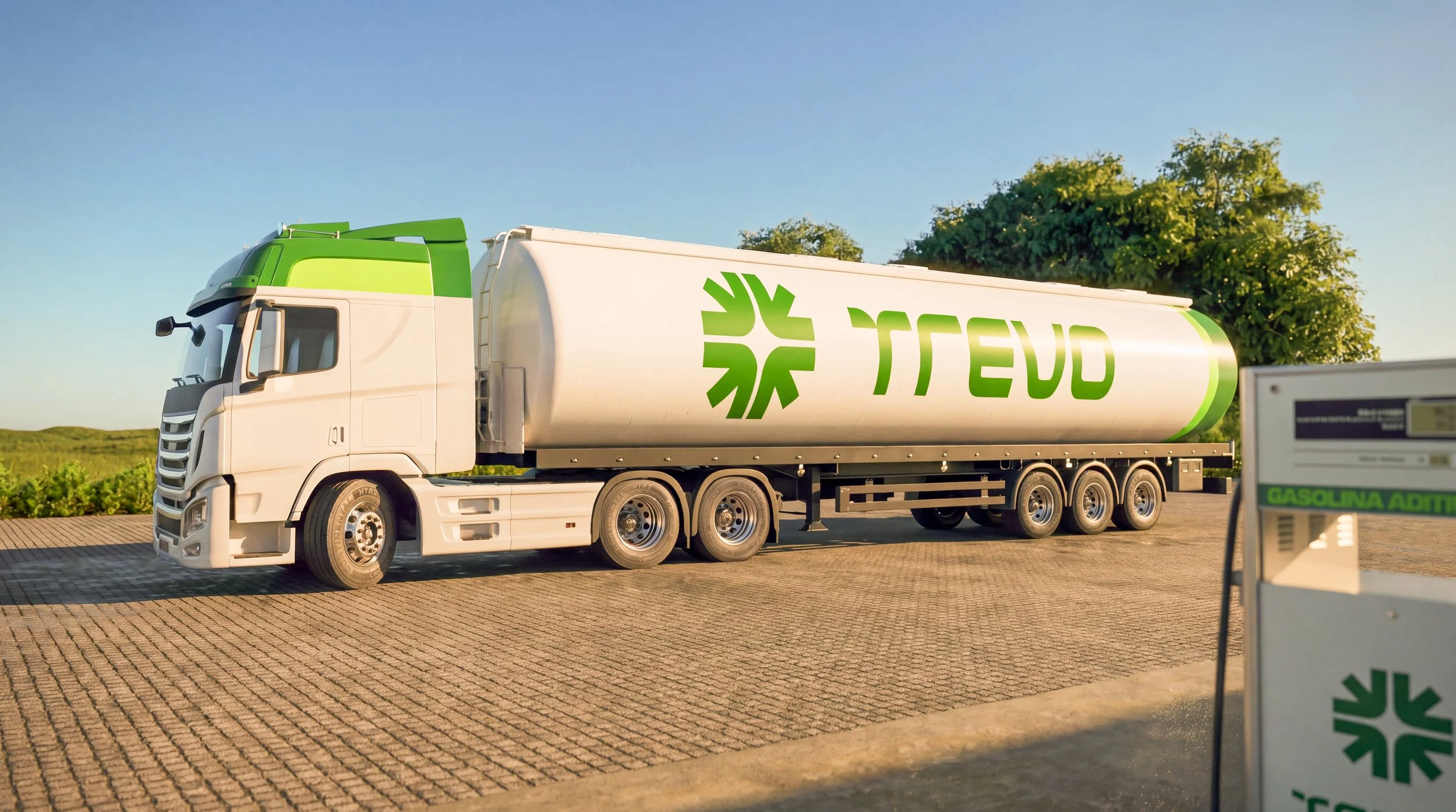
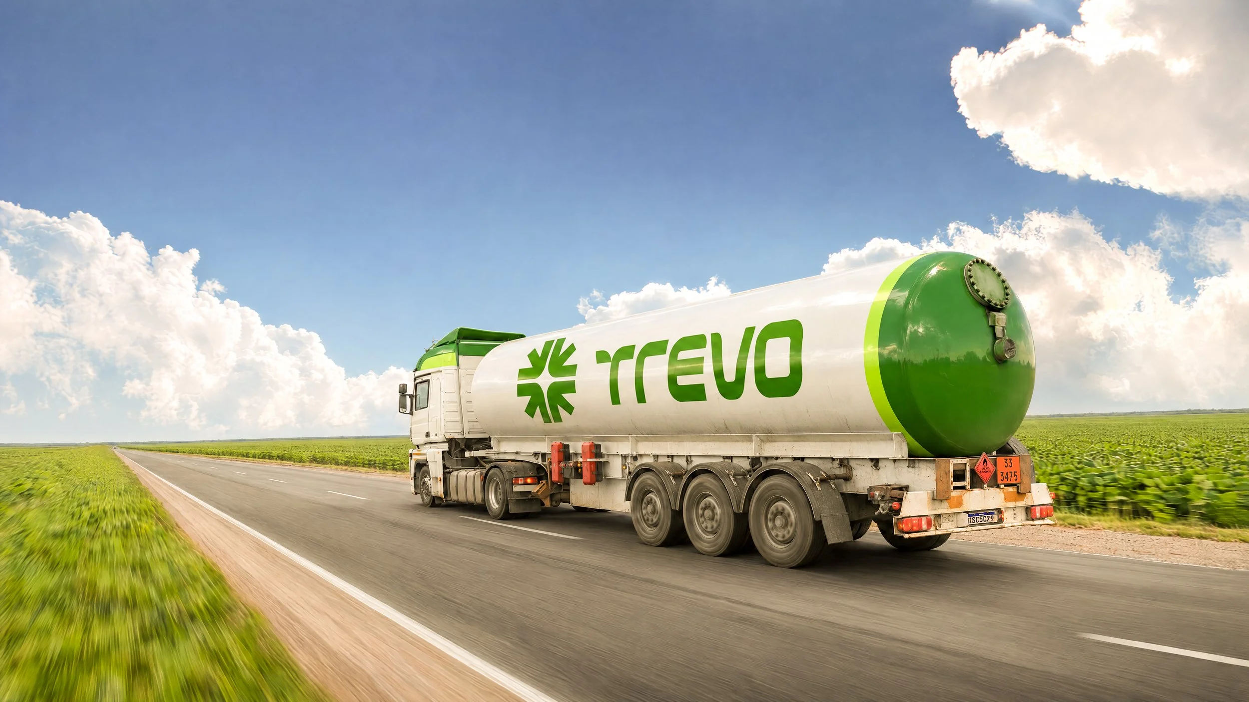
Rebranding for Grupo Trevo, a fuel company with almost three decades on the roads of Rondônia and Mato Grosso, Brazil. It operates on three fronts: fuel distribution to farms, a network of gas stations, and its own fleet of tanker trucks. The goal was to modernize the brand and reposition it for a new phase.
Rebranding para o Grupo Trevo, empresa de combustíveis com quase três décadas de estrada em Rondônia e Mato Grosso. O grupo atua em três frentes: distribuição de combustível para fazendas (TRR), rede de postos e frota própria de caminhões-tanque. O objetivo era modernizar a marca e reposicioná-la para uma nova fase.
Rebranding
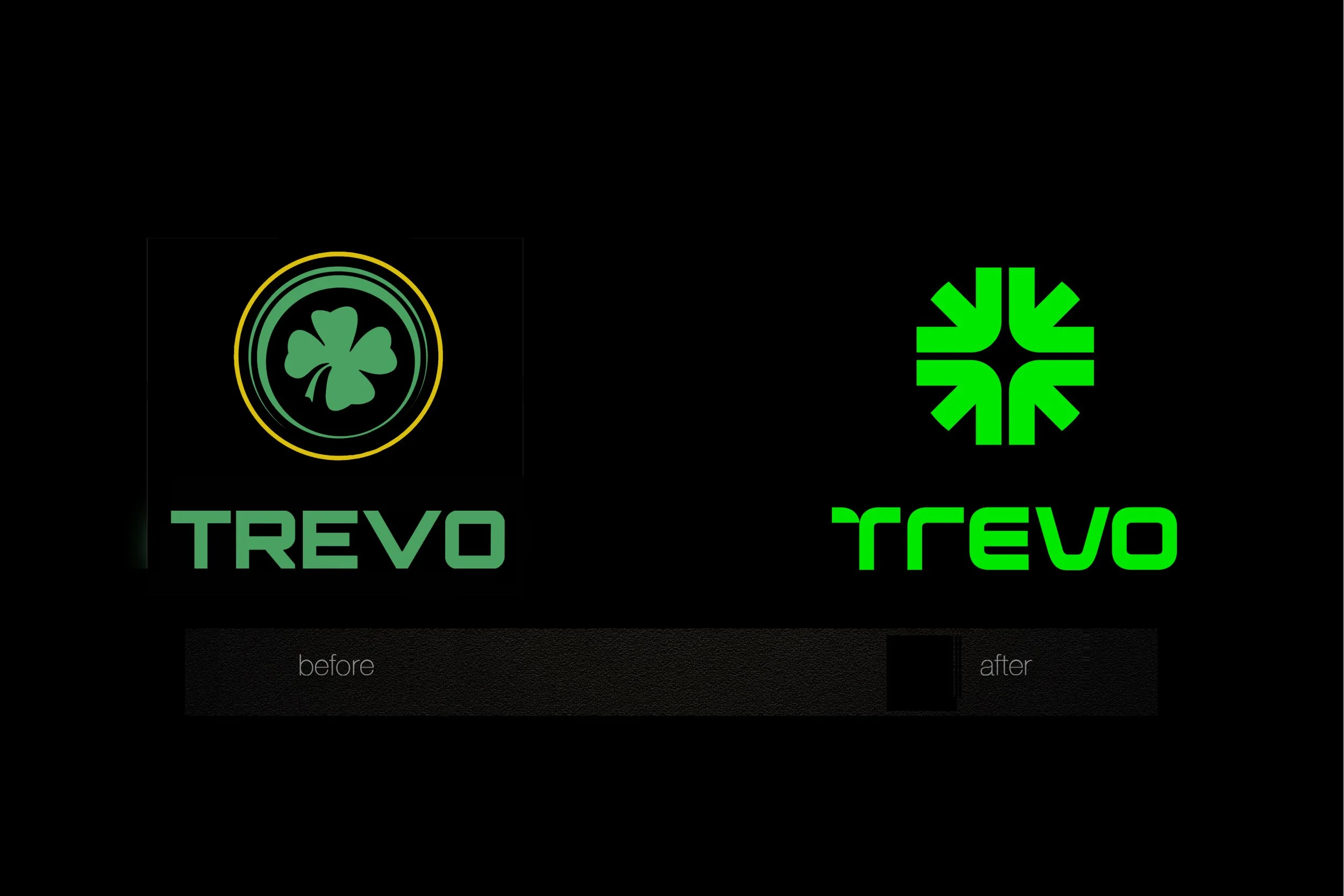
The previous logo was a four-leaf clover drawn literally, inside a double circle, set in a generic typeface. It was easy to recognize, but it had no idea of its own and said nothing about the business behind it. The redesign kept the clover and the green, the two assets the brand had built over the years, and gave them a new meaning.
O logo anterior era um trevo de quatro folhas desenhado de forma literal, dentro de um círculo duplo, com tipografia genérica. Era fácil de reconhecer, mas não tinha uma ideia própria e não dizia muito sobre o negócio. O redesenho manteve o trevo e o verde, os dois ativos que a marca construiu ao longo do tempo, e deu a eles um outro significado.
Concept
In Portuguese, trevo means clover. It is also the word for a highway interchange, the junction where roads meet and where a gas station often stands. For a company born on the road, the name already held the idea. There was a second one. In small towns across the Brazilian countryside, the gas station is more than a place to refuel. On weekends, it is where people go to meet, talk, and watch the town go by. The identity was built on both: the place where roads cross and the place where people come together.
Trevo é a planta. Na estrada, é também o entroncamento onde as rodovias se cruzam, e onde quase sempre há um posto. Para uma empresa que nasceu na estrada, o nome já trazia a ideia pronta. E havia outra. Nas cidades pequenas do interior, o posto é mais do que um lugar para abastecer. No fim de semana, é onde as pessoas se encontram, conversam e vão ver o movimento. A identidade foi construída sobre os dois sentidos: o lugar onde as estradas se cruzam e onde as pessoas se reúnem.
Symbol
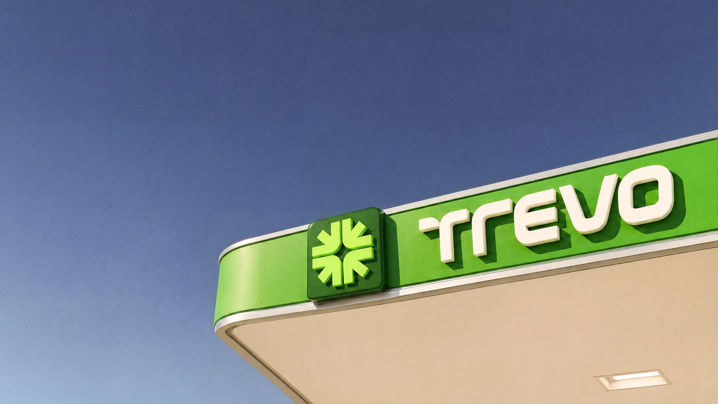
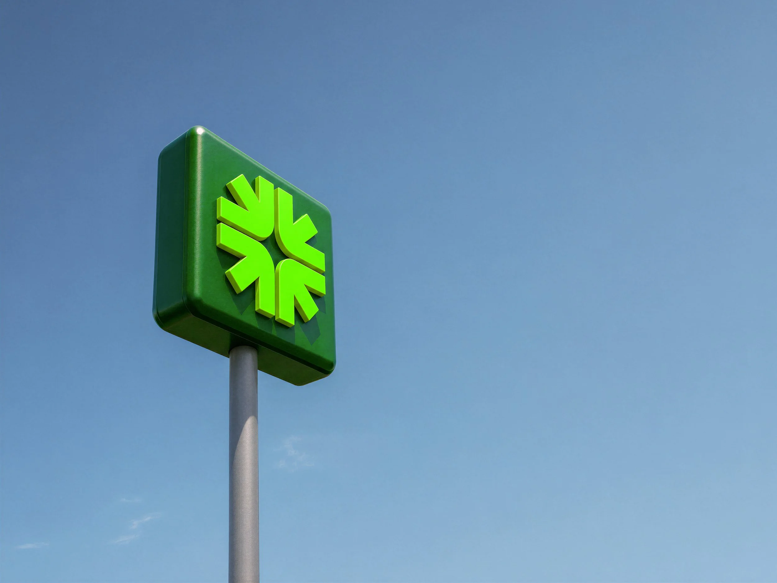
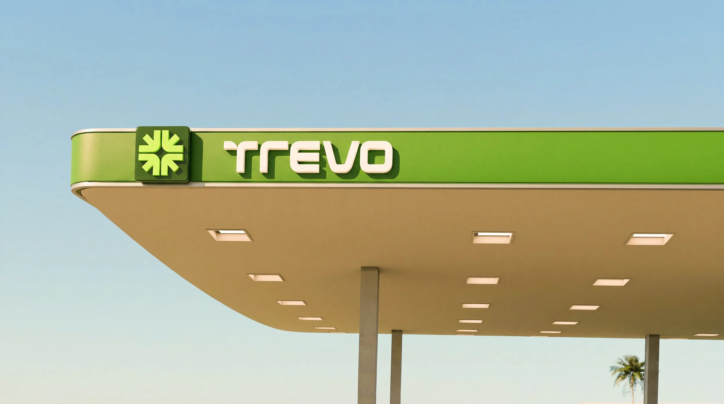
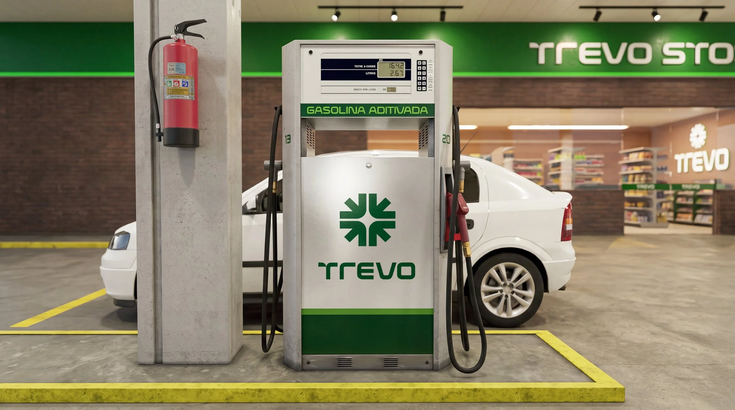
A four-leaf clover at first read. On second, four arrows converging on the same center: a point of arrival, a place where people meet. Between the leaves, the negative space draws a crossroads. The symbol speaks of location and movement at once, the two sides of a business that lives on the road. The same four leaves, the same luck. Now they also point the way.
Um trevo de quatro folhas na primeira leitura. Na segunda, quatro setas que convergem para o mesmo centro: um ponto de chegada, um lugar de encontro. Entre as folhas, o espaço vazio desenha um cruzamento. O símbolo fala ao mesmo tempo de localização e de deslocamento, os dois lados de um negócio que vive na estrada. As mesmas quatro folhas, a mesma sorte. Agora, elas também apontam o caminho.
Logotype
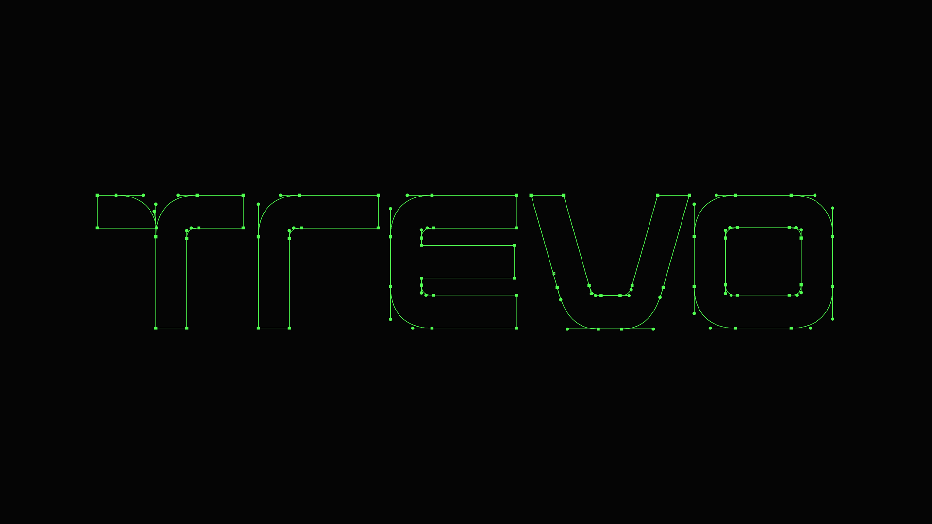
The wordmark is set in a customized version of Evolver, a display typeface whose futuristic lines suggest technology and speed. Its mix of angular and rounded corners matches the construction of the symbol.
O logotipo é composto com uma versão customizada da Evolver, tipografia display de linhas futuristas que remetem à tecnologia e à velocidade. A combinação de cantos retos e arredondados conversa com a construção do símbolo.
Colors
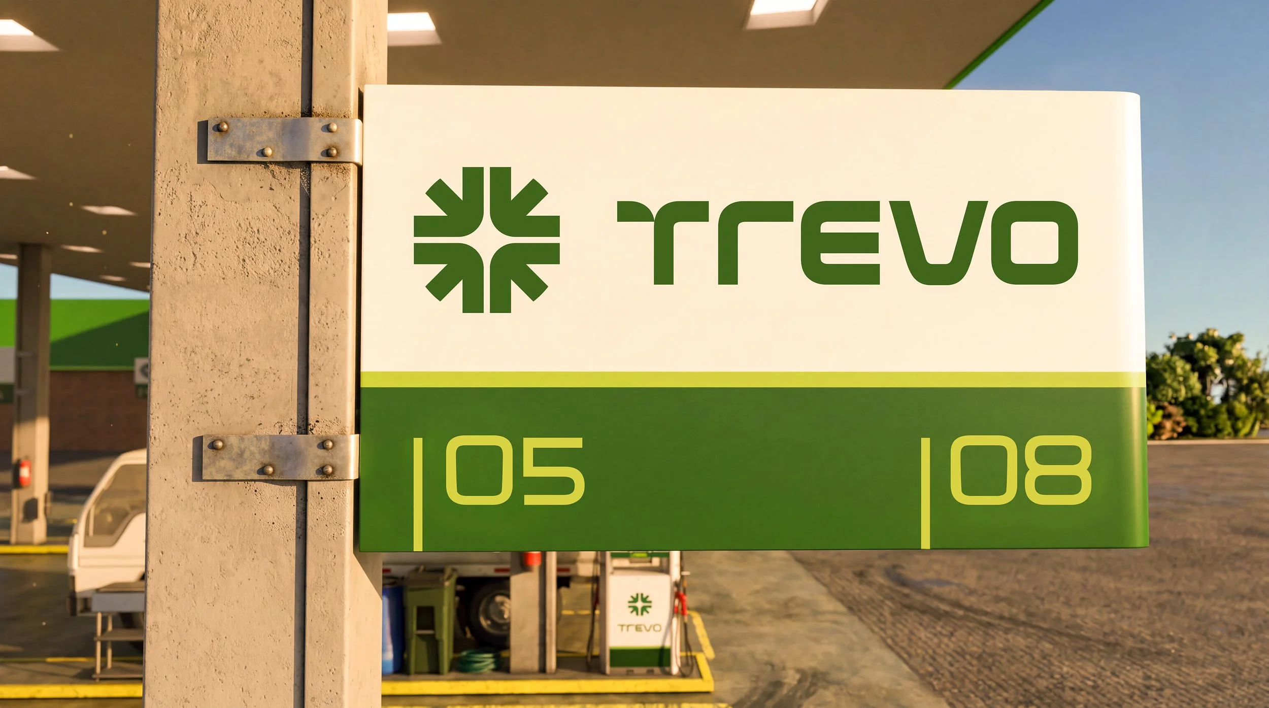
Two greens. Dark green brings the solidity of an established company. Bright green, close to the glow of a signal light, guarantees visibility from a distance, day or night. Blue and yellow come in as secondary colors, used sparingly in details.
Dois verdes. O verde-escuro traz a solidez de uma empresa estabelecida. O verde-claro, próximo ao brilho de uma sinalização luminosa, garante visibilidade à distância, de dia ou de noite. Azul e amarelo entram como cores secundárias, usadas com parcimônia em detalhes.

Results
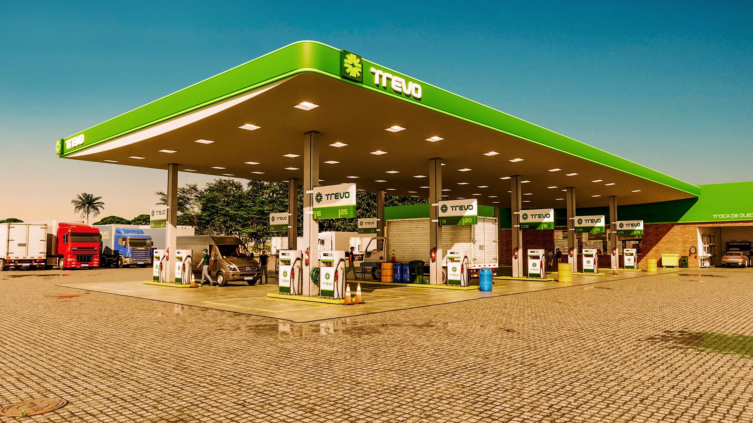
The new identity opened a new cycle of growth. Since the rebranding, Grupo Trevo has gone from two to five gas stations. The three new units are in cities across the region, taking the brand off the highway and into urban daily life. The symbol was ready for it: a crossroads works on a city corner as well as on the open road.
A nova identidade abriu um novo ciclo de crescimento. Desde o rebranding, o Grupo Trevo passou de dois para cinco postos. As três novas unidades estão em cidades da região, levando a marca da rodovia para o cotidiano urbano. O símbolo estava pronto para isso: um cruzamento funciona tanto na esquina da cidade quanto na estrada.