Yoyou
Naming, visual identity and packaging for Yoyou, an independent skincare brand created by two women with a simple conviction: a complete routine fits in eight products.
Naming, identidade visual e embalagens da Yoyou, marca independente de skincare criada por duas mulheres a partir de uma convicção simples: uma rotina completa cabe em oito produtos.
Naming
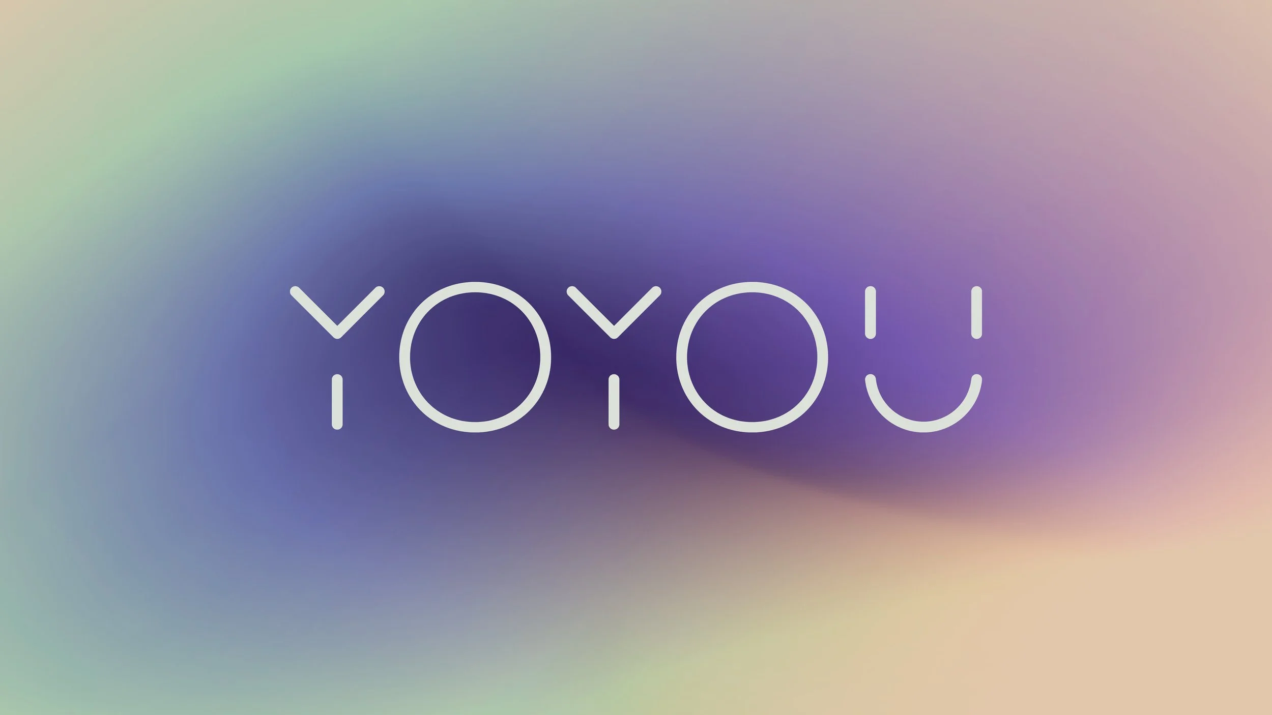
Yoyou was chosen by ear. The name bounces like yoyo, breathes like yoga, and needs no instructions in any language. Hiding in plain sight, a nudge: hey, you. Your turn.
Yoyou foi escolhido de ouvido. O nome quica como ioiô, respira como yoga e funciona em qualquer língua. E traz dentro dele um chamado ao autocuidado: ei, você. Cuide-se.
Logotype and symbol
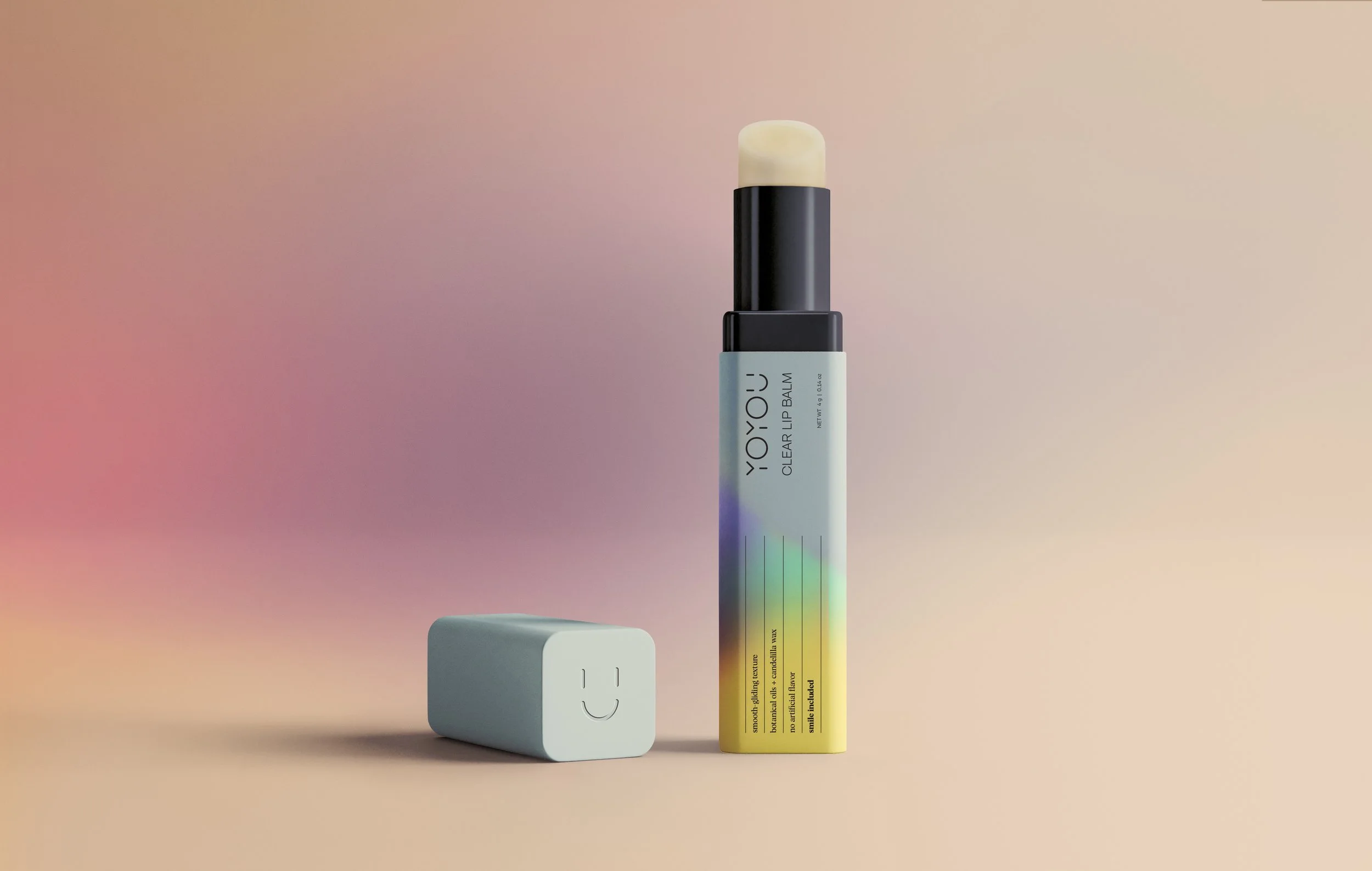
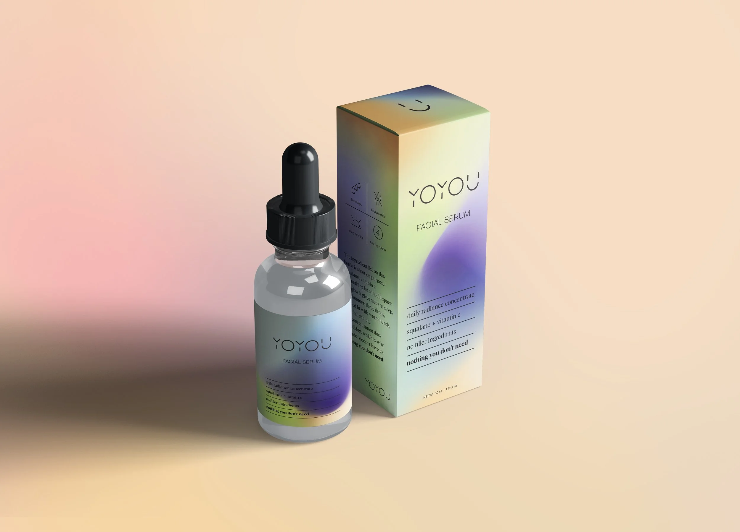
The logotype is a thin monoline with letters interrupted on purpose. The gaps turn into figures. In the Y, a person raises both arms, celebrating the small daily win of looking after yourself. But it is in the U that the brand shows its face: a smile, and whoever sees it smiles back. The symbol that carries the brand's good humor.
O logotipo é uma monolinha fina, com cortes propositais nas letras. Dos cortes nascem figuras. No Y, uma pessoa de braços erguidos, como que comemorando a pequena vitória diária de cuidar de si. Mas é no U que a marca mostra sua cara: um rostinho sorrindo, e quem vê já sorri de volta. É o símbolo que carrega o bom humor da marca.
Packaging
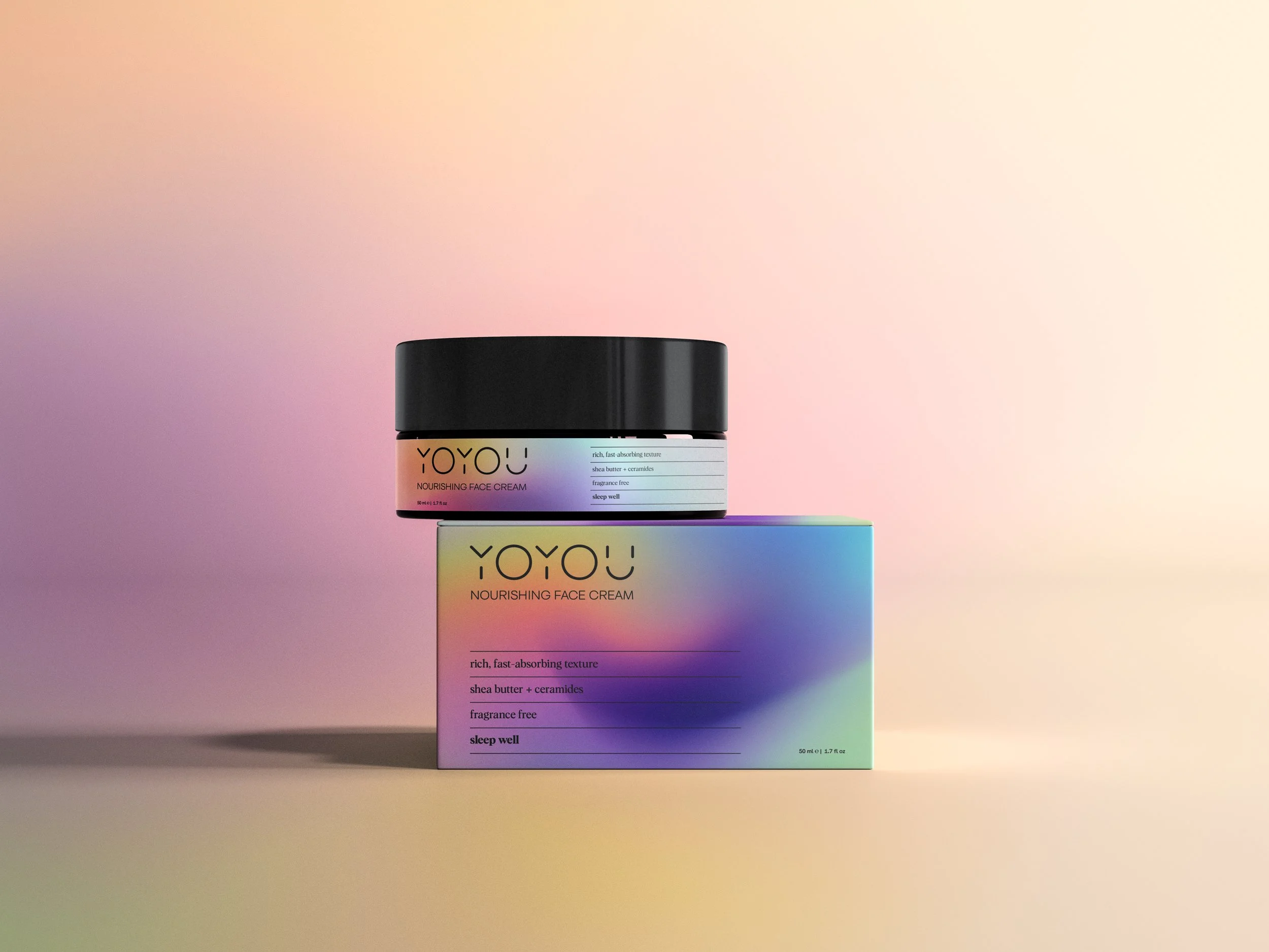
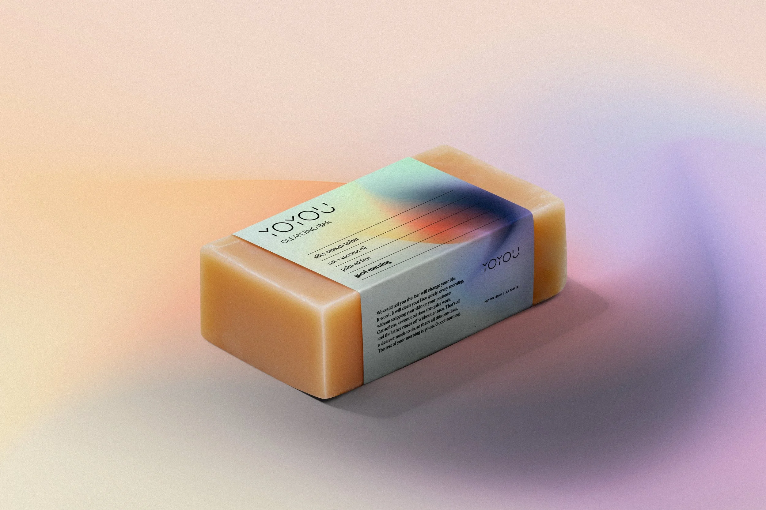
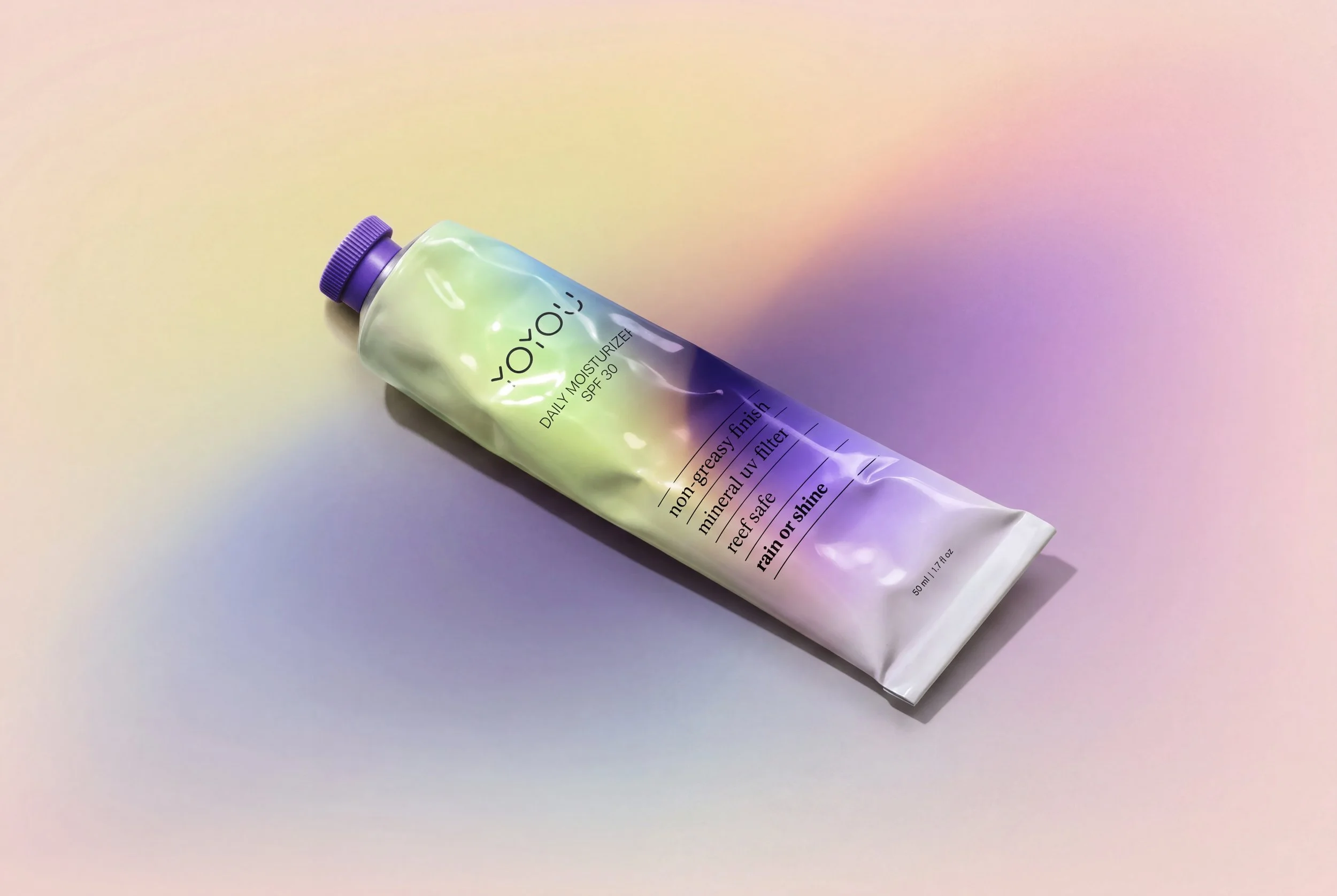
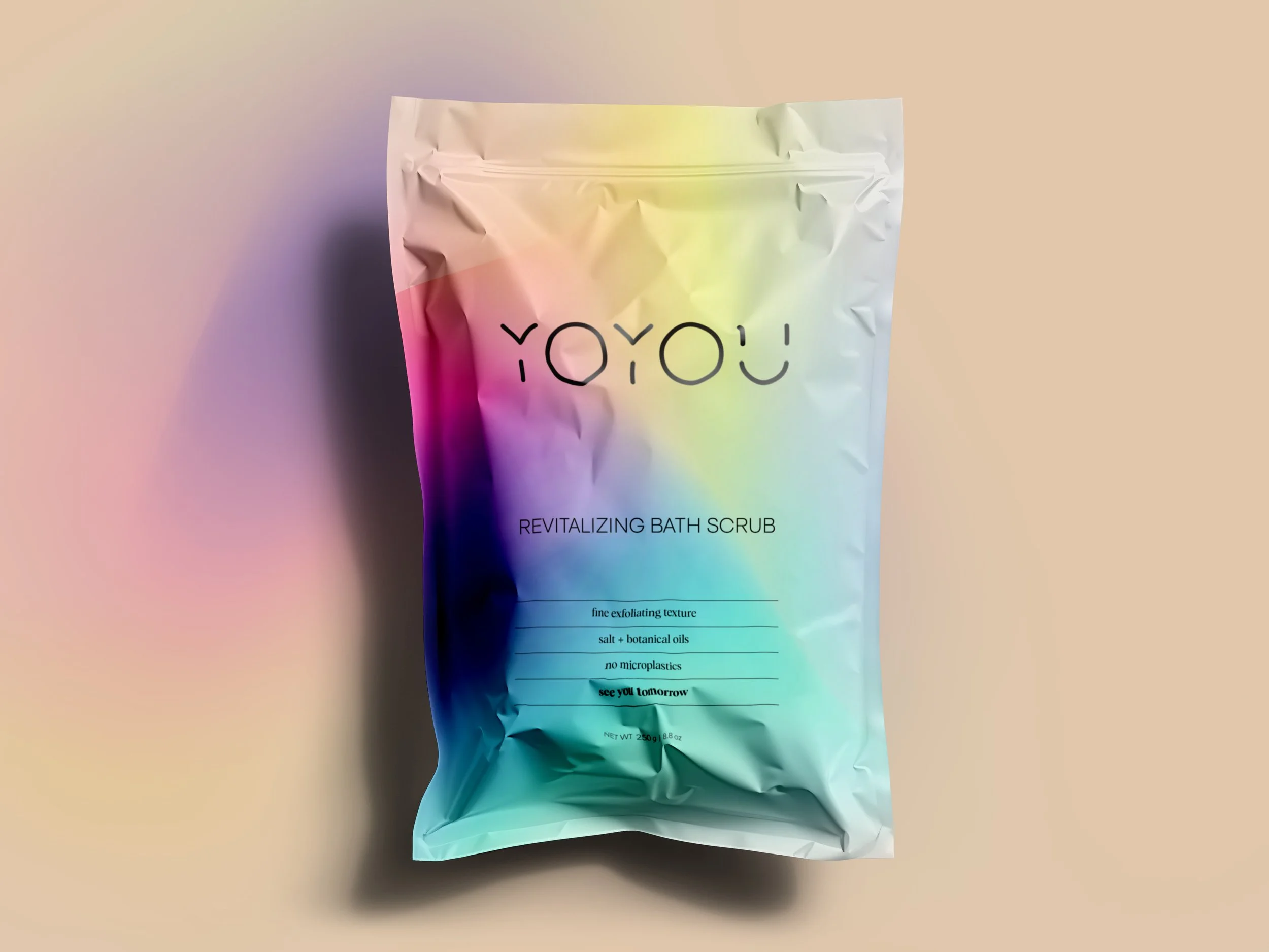
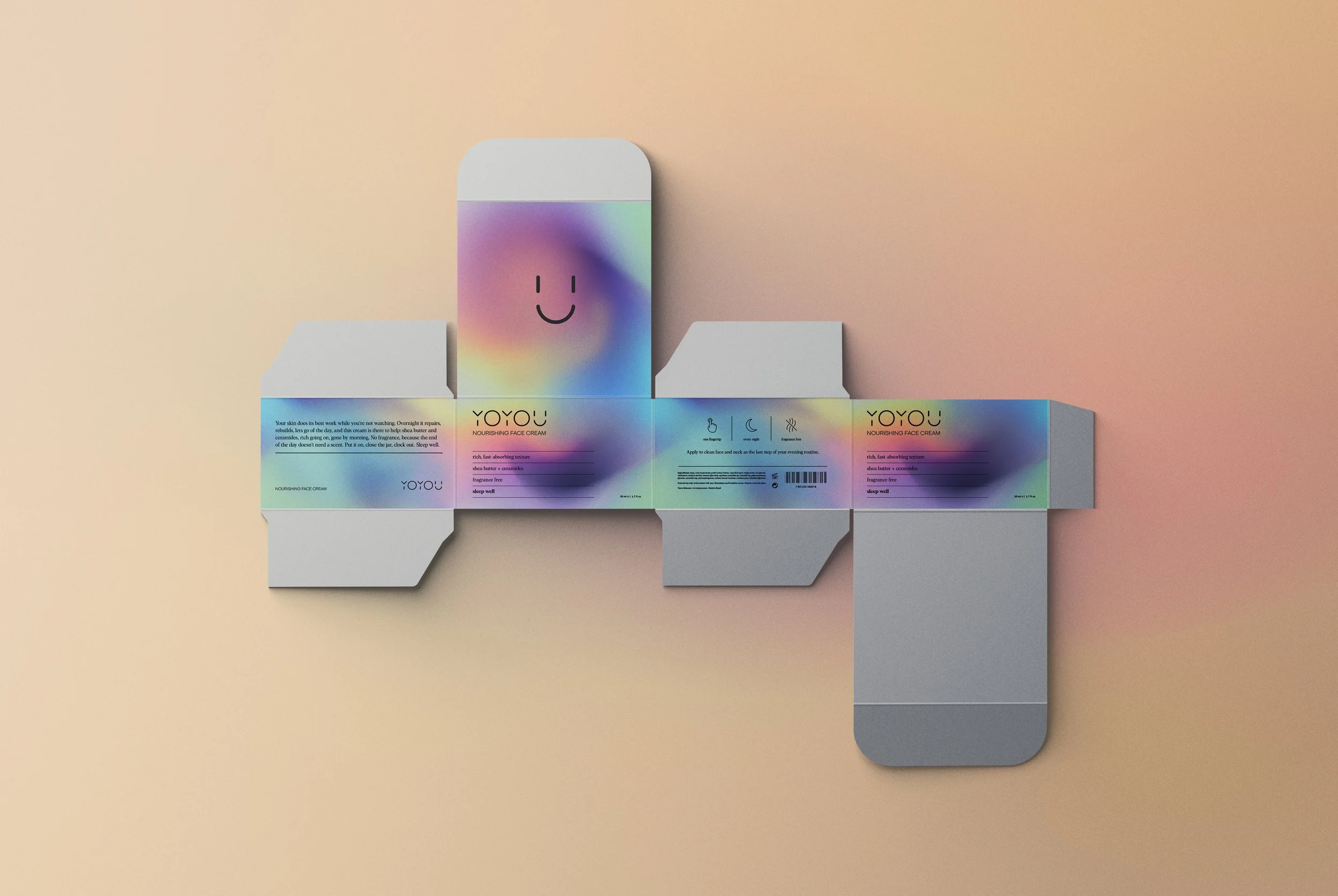
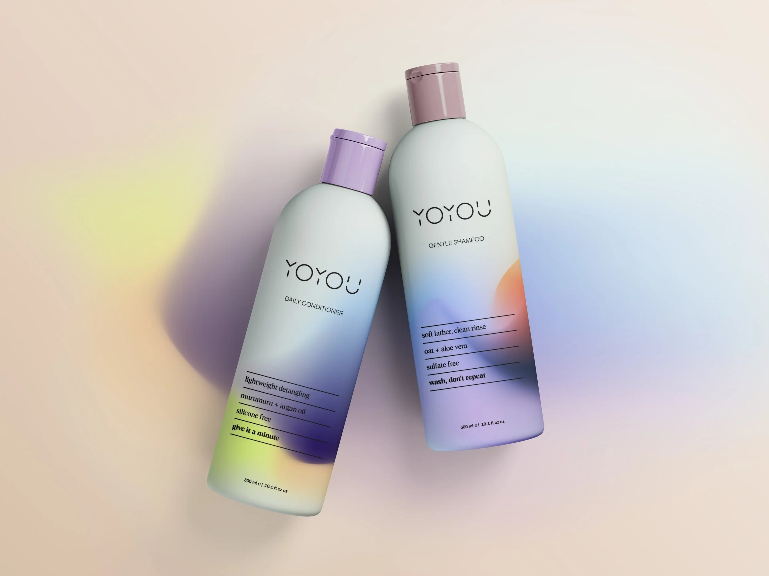
The Yoyou label works like a filled-in form. Brand and product name on top; below, four ruled lines, four facts in lowercase: texture, composition, what was left out. No claims, no percentages. Honesty as a layout decision.
The fourth line is where the brand smiles. good morning on the cleansing bar. sleep well on the night cream. smile included on the lip balm. wash, don't repeat on the shampoo. see you tomorrow on the bath scrub. Read in sequence, the eight lines tell a whole day.
O rótulo da Yoyou tem jeito de ficha técnica: marca e produto no alto, quatro linhas pautadas logo abaixo, quatro fatos em caixa baixa. Fala da textura, da composição, e o que não entra de jeito nenhum. Nada de promessa, nada de porcentagem. Honestidade como decisão de layout.
Na quarta linha, a marca sorri. good morning no sabonete facial. sleep well no creme de noite. smile included no lip balm. wash, don't repeat no shampoo. see you tomorrow no esfoliante. Lidas uma atrás da outra, as oito linhas contam um dia inteiro.
Graphic elements
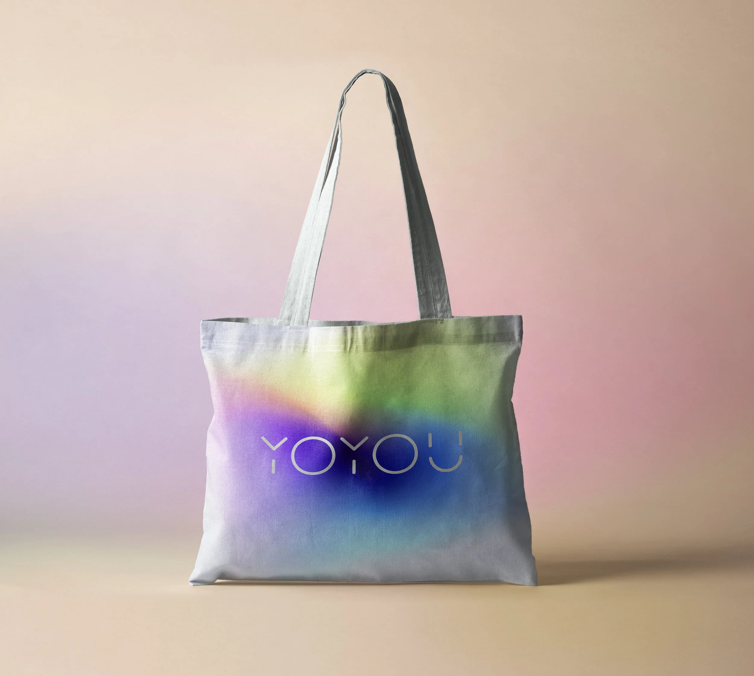
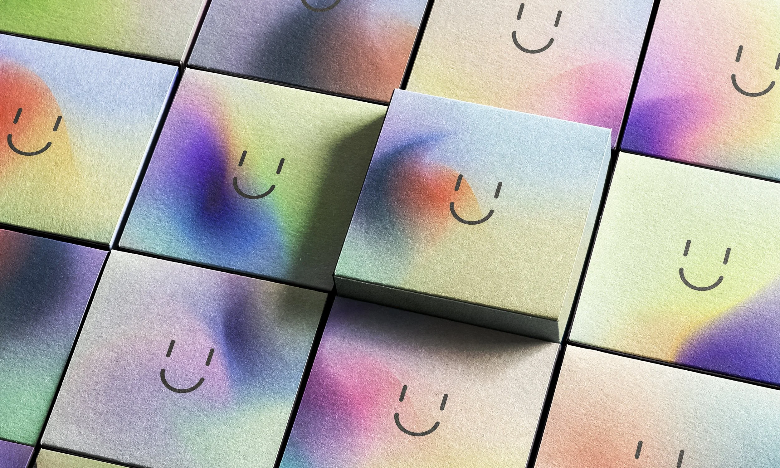
The gradients behave like the formulas they wrap: ethereal, fluid, almost liquid, color spreading the way cream spreads on skin. Each product carries its own blend.
Os gradientes parecem feitos das próprias fórmulas: etéreos, fluidos, quase líquidos, a cor se espalhando como creme na pele. Cada produto tem o seu grafismo na embalagem, cada produto carrega a sua própria mistura.